-
Ed Roberts
Founder
The Nightmare Factory
www.nightmarefactorysalem.com
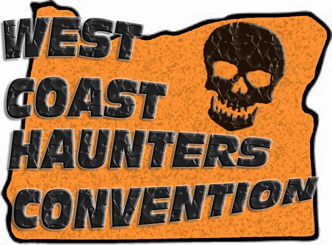
www.westcoasthauntersconvention.com -
you doing t-shirts on these or the one chosen?
let me know how to order. need 4XL (or one size fits new jersey) let me know. thanks! i like both logos (by the way) chuck (philly suburbs) -
I'll preface this by saying I am not a graphic designer or in anyway really qualified to judge a logo design, but just my opinion as a lay person.
They are both really busy. Maybe that works better as it might force people to look harder, but at first glance it is a little difficult even to make out letters.
Of the two I like the electric one better.----------------------------------------------
A.J. PorfirioComment
-
Im a fan of clean logos that can easily be read and easily made black and white. What do you think of something like this? It gives a ton of info just looking at it. Im no graphic designer, but It may be closer to the right direction, then again, it may not.
Comment
-
Yeah Ed, they are both too busy. I do like the second one better, but the red lettering on the orange background is still hard to see. Personally I liked last years logo...
-Joel-Heartstoppers
Haunted House
Sacramento, CA
www.scaredyou.com
www.fb.com/heartstoppers
www.twitter.com/heartstoppershhComment
Hauntworld Home -
Hauntworld Magazine -
Haunted Supplies -
Find Vendors -
Haunt News -
Hauntworld Facebook -
Contact Us -
Advertise
 Tweet
Tweet
2020 Hauntworld.com | All Rights Reserved & 1994-2020 Halloween.com
Powered by vBulletin® Version 5.6.1
Copyright © 2024 MH Sub I, LLC dba vBulletin. All rights reserved.
Copyright © 2024 MH Sub I, LLC dba vBulletin. All rights reserved.
All times are GMT-6. This page was generated at 1 minute ago.
Comment