Announcement

Collapse
No announcement yet.

Twisted Woods Logo help

Collapse
X
 
  • Filter
  • Time
  • Show
Clear All
new posts

  • Twisted Woods Logo help

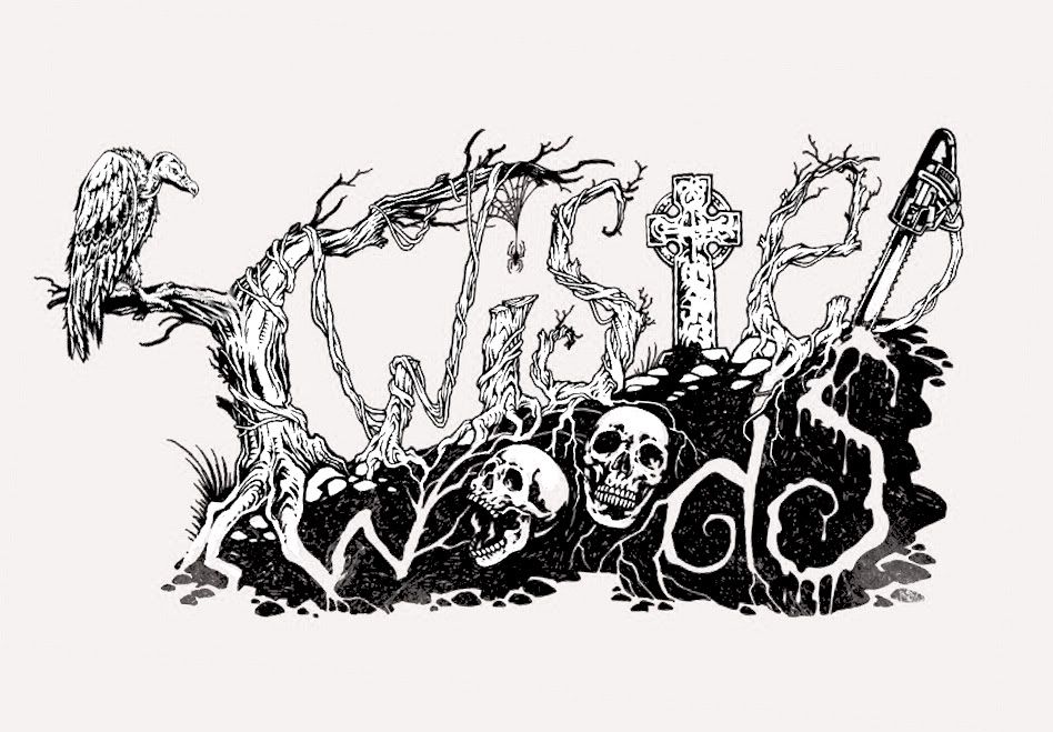
    Which one do you like better? Any comments would be appreciated.
    A)... TWISTED WOODS revise.jpg


    B)...TWISTED WOODS INK.jpg

    Thank you for your help
    Shawn
    Twisted Woods

  • #2
    i really like the black and white better than the red.

    Comment


    • #3
      Neither one can you read what it is...It took me a minute to realize that the tree is supposed to be a "T". If I had this problem I KNOW your customers will too and they won't take the time to figure it out!

      I LOVE the concept though...I think you should give another go, clear up the letters a bit...maybe not have them be objects but still work them into the artwork. Then, it'd be perfect if rendered in 3D and not a flat line drawing.

      Looks good though, kudos to the artist. -Tyler
      Chris Riehl
      Sales@spookyfinder.com
      (586)209-6935
      www.spookyfinder.com

      Comment


      • #4
        I think it has too much going on. Clean, simple and bold always looks better in my opinion. Also think about how it looks for branding, logos on shirts and coupons etc. It should be legible and recognizable.

        DA

        Comment


        • #5
          Very hard to read either.

          Comment


          • #6
            Um....

            They are both super cool... but really hard to read.
            The haunt name should be very clear block letters. Get creative around that.
            www.frightprops.com

            [FrightProps Blog]
            [Google+] [YouTube]
            [Facebook] [Twitter] [Tumblr] [Pinterest]

            sigpic

            Comment


            • #7
              i like it! Top one is easiest to read.
              Maybe change the branch on the t to come down to look more like a t. otherwise it
              looks really good.
              Damon
              Frightmasters
              www.houseoffright.com
              Damon Carson

              Comment


              • #8
                I think they both look pretty good. And I like the red one the best.
                I agree with Damon though, maybe you should bring the limb with
                the buzzard on it down a bit more and lengthen it a little to.
                It will look more like a T then.
                sigpic
                a.k.a. The Butcher
                a.k.a. Hauntlord

                Comment


                • #9
                  yeah what damon said.... i like the first one better and i can read it fine. would look great on a websght,shirt ,poster or flyers. i probably wouldnt use it as a haunt sign for passer by's on the hwy tho, because they cant read it at a glimpse driving 55

                  Comment


                  • #10
                    And...

                    Never let any type-setter put your haunt name in Gothic letters! Unreadable mostly!
                    Your logo is art. Art has to be somewhat encoded, adding some mystery and the fun of the audience's fun of discovery when they figure it out!
                    But..."art" versus "Functionality" can be mutually exclusive and will not be traded within those two seperate spheres often times.
                    The art of the logo might be great on a shirt but not a sign along the road.( Been there, done that)
                    hauntedravensgrin.com

                    Comment


                    • #11
                      B is a more interesting artwork due to the range of elements in the word 'Twisted', great illustration, not so much graphic design.

                      They'd both make great additions to the marketing presence of the haunt but I'm not sure either would qualify for the label 'logo'.

                      Comment


                      • #12
                        Dark,
                        Honesty and tactfulness are not bitter enemies who cannot coexist. I think all the replies are honest and tactful.
                        I like the logo, but It will give an impression of your show quality and may slightly limit your audience. At the same time I dont think thats a bad thing. Make sure you know what you are trying to say about your show and make sure your logo says it. Im going to talk about logos a bit at my MHC class on haunt design.
                        I popped your logo in photoshop and made some of the suggested alterations, I also upped the contrast so that the letters pop a bit more.
                        Allen H


                        www.Stiltbeaststudios.com
                        http://www.youtube.com/user/Stiltbea...s?feature=mhee

                        Comment


                        • #13
                          Dark this isnt the only logo Shawn has for Twisted Woods. This is just another very creative piece of artwork. I have seen drawings of the Evil Dead films that remind me of this. Its probably why I like this. Why wouldnt we be honest?! That doesnt even make sense. Not everyone is like you with all your negative comments. Again this would be a great for a tshirt or coupon or even a flyer. Not as a billboard or main logo. Which it is not.
                          Damon
                          Frightmasters
                          www.houseoffright.com
                          Damon Carson

                          Comment


                          • #14
                            If you look at corporate logos yours is far to detailed and complex.

                            Comment


                            • #15
                              I like it. I'm a texture eye candy kinda girl, so all of the intricate details of it appeal to me. Whether it translates well to a logo, I dunno, but as art, it's awesome.
                              Kimmy


                              http://hauntedkimmycreations.weebly.com/

                              Comment

                              Working...
                              X