Announcement

Collapse
No announcement yet.

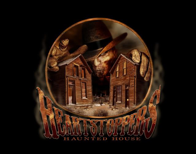
New logo, please check it out!

Collapse
X
 
  • Filter
  • Time
  • Show
Clear All
new posts

  • New logo, please check it out!

    Hello all,

    I just wanted to show off my new baby to you guys. Please let me know what you think. I want honesty!!

    And a plug here for Travis Magee who did this amazing work for me. Let me tell ya, if you need someone who is easy to work with and has some amazing artistic skills, check this guy out! He listened to every suggestion and answered all my questions with a professionalism that I am finding rare these days.

    Not sure if he has a web site up yet, but you can find him here at Hauntworld and on MySpace at www.myspace.com/travis_magee

    -Joel-
    Heartstoppers
    Haunted House

    Sacramento, CA

    www.scaredyou.com

    www.fb.com/heartstoppers
    www.twitter.com/heartstoppershh

  • #2
    I like it! Looks cool!

    Larry
    Larry Kirchner
    President
    www.HalloweenProductions.com
    www.BlacklightAttractions.com
    www.HauntedHouseSupplies.com
    www.HauntedHouseMagazine.com

    Comment


    • #3
      Looks really good!

      Jared
      Jared Layman

      Comment


      • #4
        I like it!
        Brian Warner
        Owner of Evilusions www.EVILUSIONS.com
        Technical Director of Forsaken Haunted House www.Forsakenhaunt.com
        Mechanical Designer (animatronics) at Gore Galore www.Gore-Galore.com

        Comment


        • #5
          Looks wicked!

          Comment


          • #6
            SWEET, makes you want to check it out.
            Giving People The Chills Since 2005

            http://www.warehouse31.com

            Comment


            • #7
              Oh, Joel....
              That is wickedly sweet! It's kind of like Freddy Krueger meets Ghost Town. Very spooky! CONGRATS!!

              Comment


              • #8
                Don't forget the small b&w icon

                I see only one problem with your logo.


                The text disappears when it is a small black and white logo. A common mistake.

                Comment


                • #9
                  Wow, thanks everyone for the kind words, I love it too!

                  Infoamtek, thanks for the response, but for the life of me I can't think of anywhere I would use this image as a small black and white...maybe a big one for newspaper adds. Can you help me out here, what situation would call for a small black and white image?

                  Everyone, please keep any thoughts coming!

                  Thx
                  -Joel-
                  Heartstoppers
                  Haunted House

                  Sacramento, CA

                  www.scaredyou.com

                  www.fb.com/heartstoppers
                  www.twitter.com/heartstoppershh

                  Comment


                  • #10
                    Looks good, but the logo has just too many brownish colors. Needs some other colors (like red) to stand out more.
                    The Haunter's Depot
                    www.HauntersDepot.com

                    The Haunter's Depot -- You Can Scare Them! We Can Help! (A division of Haunted Ventures FX.) We are your premier source for Halloween merchandise. Thousands of products available including costumes, masks, static and animated props, changing portraits, makeup supplies, special visual and audio effect equipment, glow necklaces, lightsticks, and MUCH more!

                    Comment


                    • #11
                      I agree with pretty much everyone. I think if you maybe make the fog green and have different colored lights in the houses possibly red I think it could look much better and scary.
                      Spooky Wishes
                      Noah


                      City Blood: Ohio, Kentucky & Indiana's #1 Haunt Site!

                      http://www.ohioshaunted.com

                      Comment


                      • #12
                        yup... it kicks...
                        Virgil: Master Of The Ethermuse

                        Comment


                        • #13
                          Originally posted by HauntVentFX View Post
                          Looks good, but the logo has just too many brownish colors. Needs some other colors (like red) to stand out more.
                          But, the browns represent the dry earth, the dust and filth. In other words....a ghost town which is what Heartstoppers is all about.

                          Comment


                          • #14
                            hello everyone...

                            Yea, we went with the earthtones and rustic look to flow with the 'ghost town' theme. I originally had purple skies and red text and an overall different tone to it, but it started to look a bit more "commercially". Joel suggested the earthtones and I think it flows much better now with the theme.

                            Also.. The logo was not designed to be a tiny black and white avatar or something else like that. A simple one color logo is ideal for that type of use. Since this is going to be blown up very large for different uses, I wanted to keep as much detail in it as possible. A client can request a simple version of the logo (solid text in black or white) for letterheads or anything smaller if they like at anytime so thats not an issue.

                            overall..glad you guys like it.
                            www.myspace.com/travis_magee

                            Comment


                            • #15
                              I like the earthtones. Red does attract the eye...however, this catches the eye, too - simply because it relates to their theme. Reminds me of an old sepia-toned photo.

                              Great work, Travis!
                              www.mindseizure.com
                              www.myspace.com/mindseizurehauntedhouse

                              Comment

                              Working...
                              X